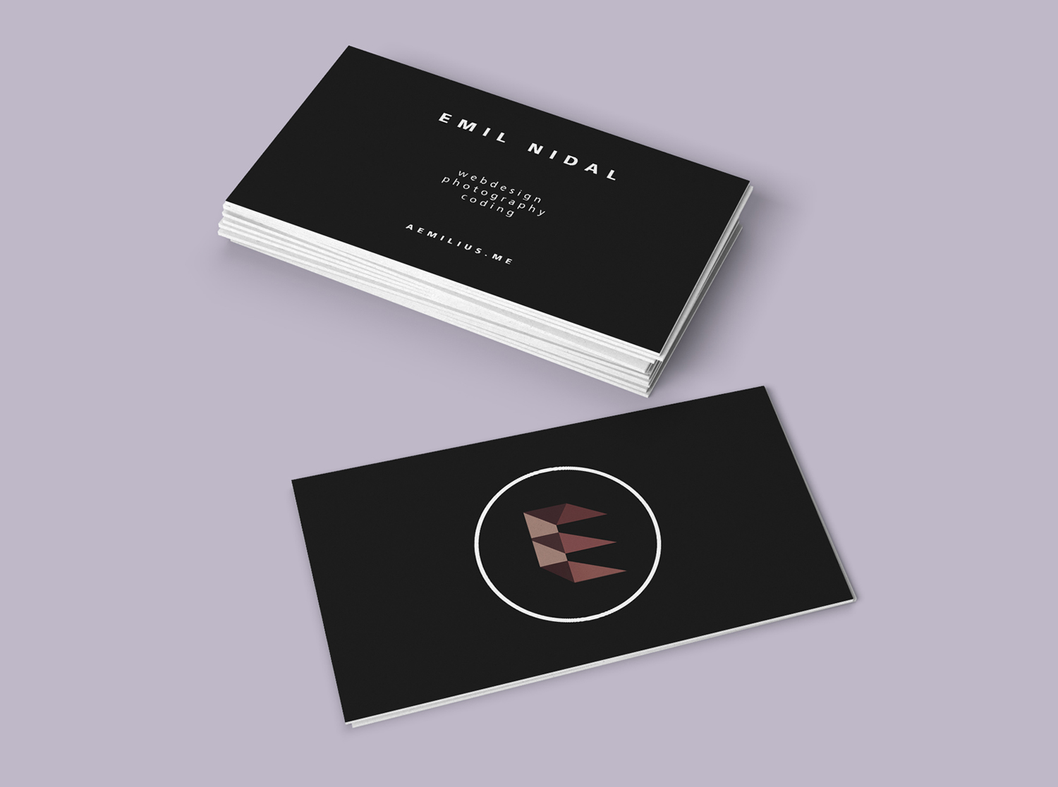
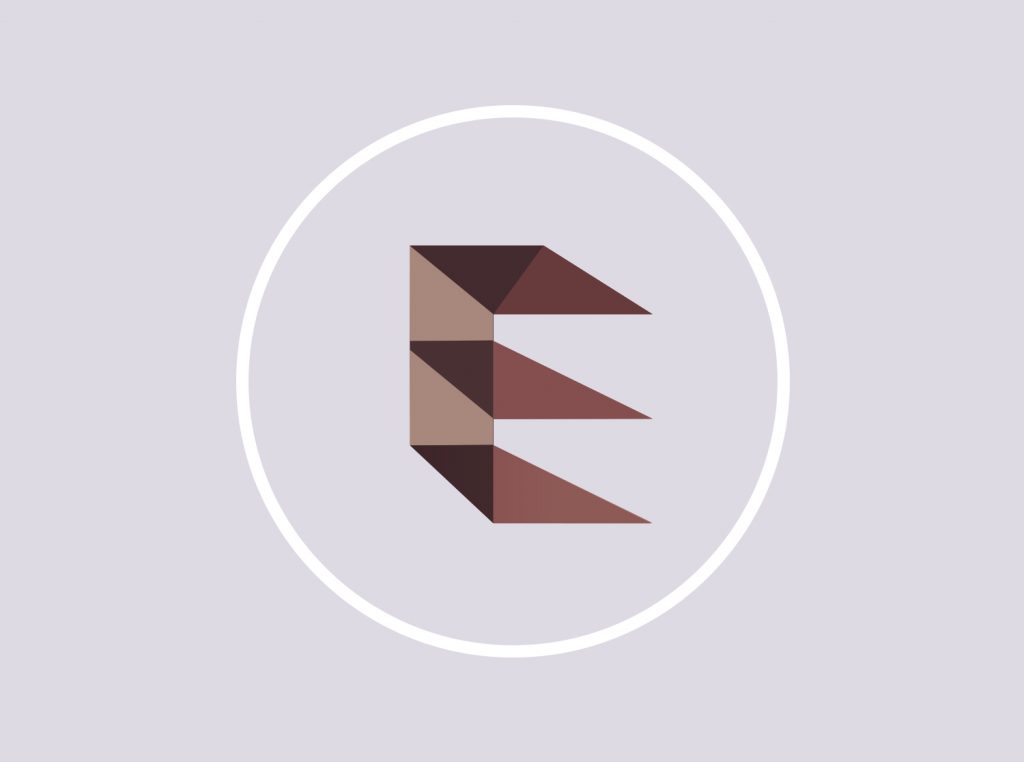
Aemilius needed a logo for their freelance business, one which represented the high end, and sleek minimalist service they provide in UI and webdesign. For their needs as a digital freelancer, a lettermark was the most effective form for the logo as it is easily resizable into smaller formats such as mobile, therefore sizability and legibility were important aspects to consider whilst brainstorming ideas for the logo.
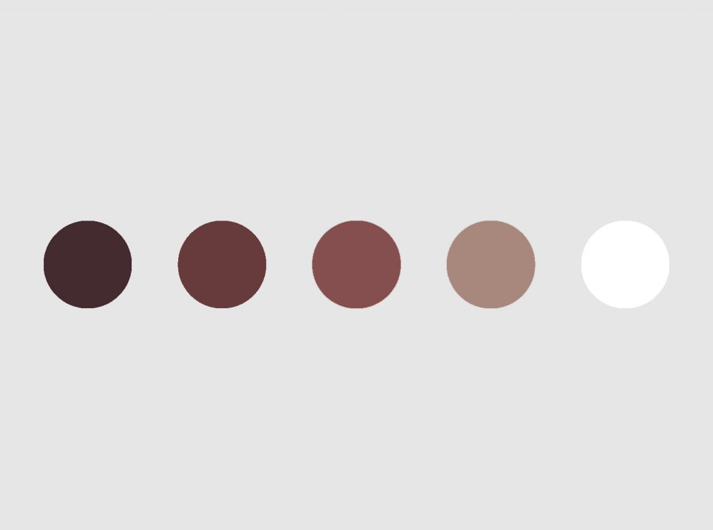
The style of the logo is an E which stands for Emil, short for Aemilius in '2.5D' as it represents the versatility and dynamic nature of Aemilius' work, whilst remaining modern and simplistic, showcasing clear and concise design solutions similar to the service they provide. The dark red colour scheme was chosen for the connotations of luxury, sophistication whilst also being a strong colour, to represent Aemilius' high quality service.